PINCHY'S CHAMPAGNE & LOBSTER BAR
INTERIORS
INTERIORS
Background
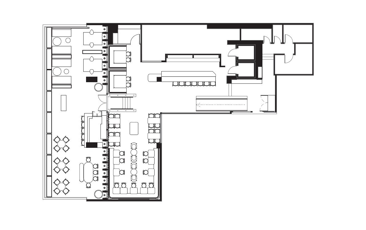
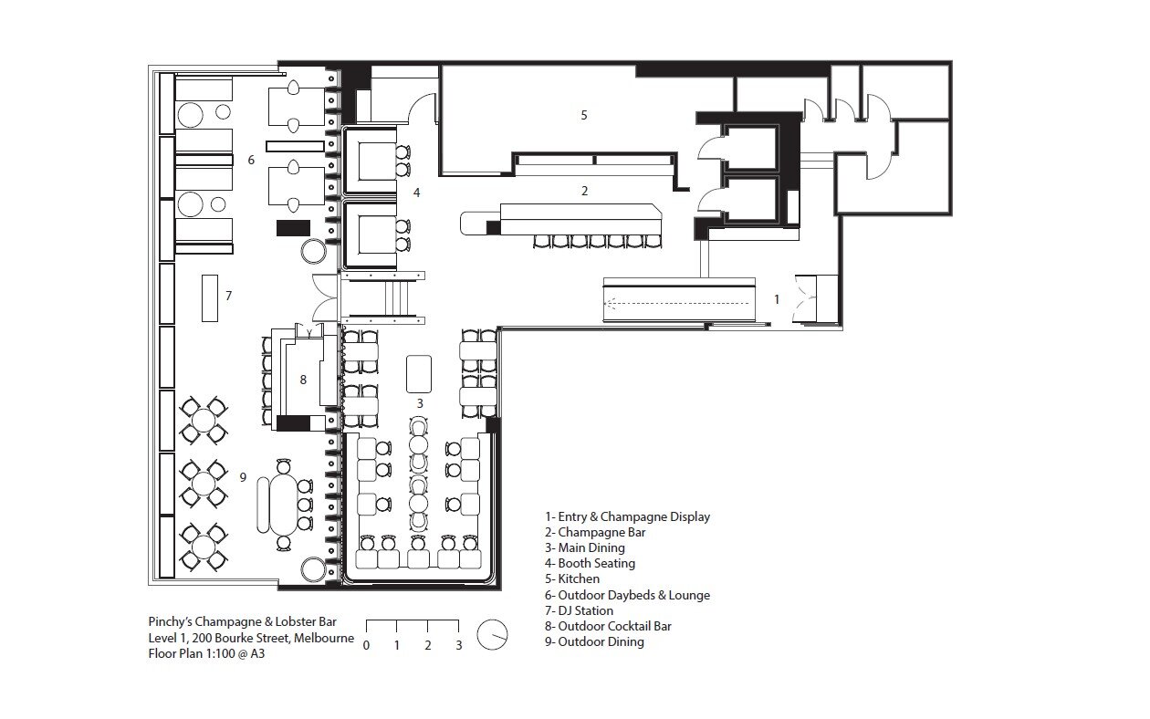
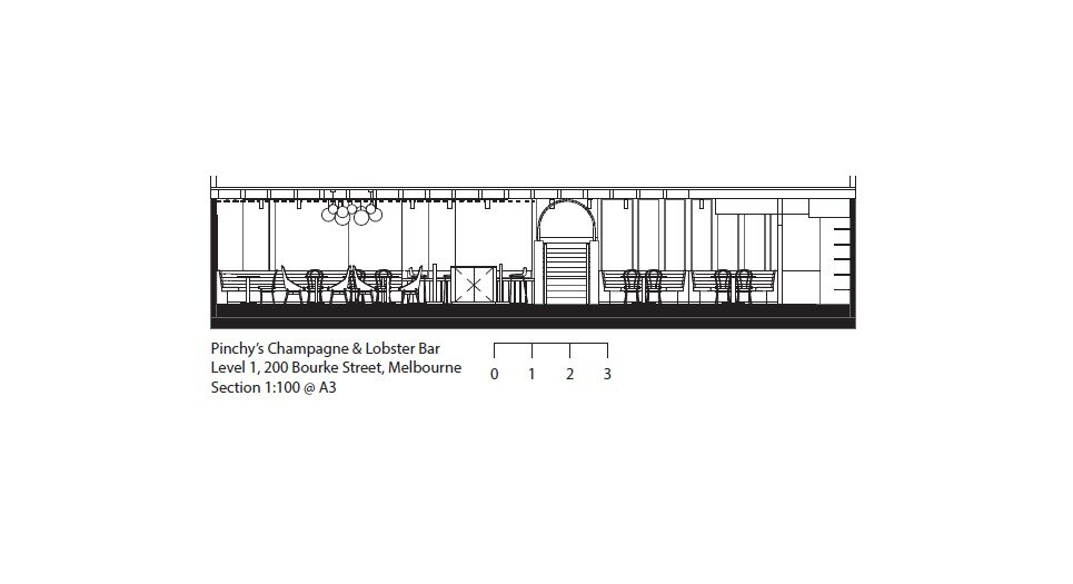
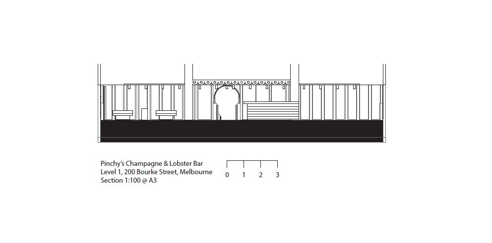
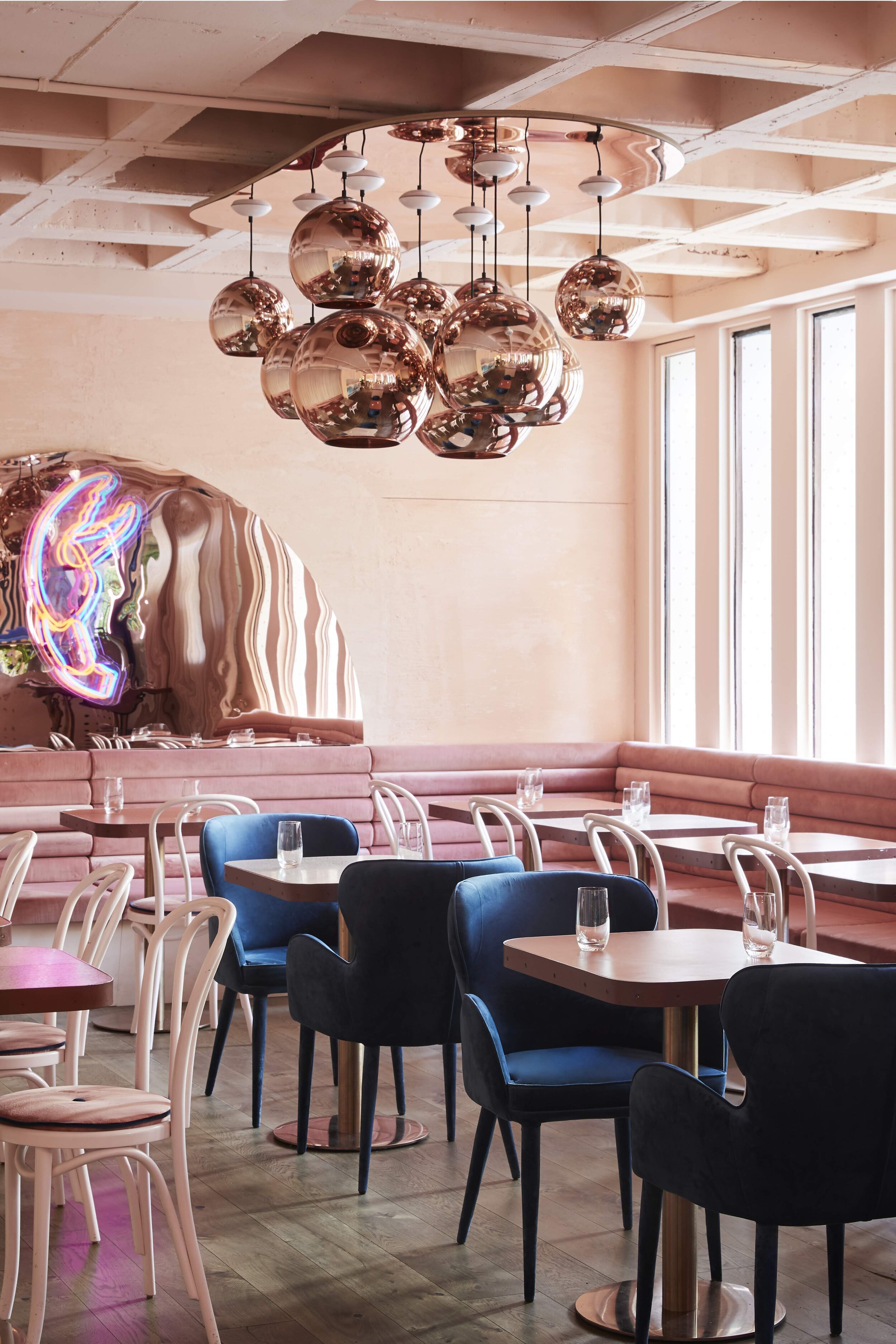
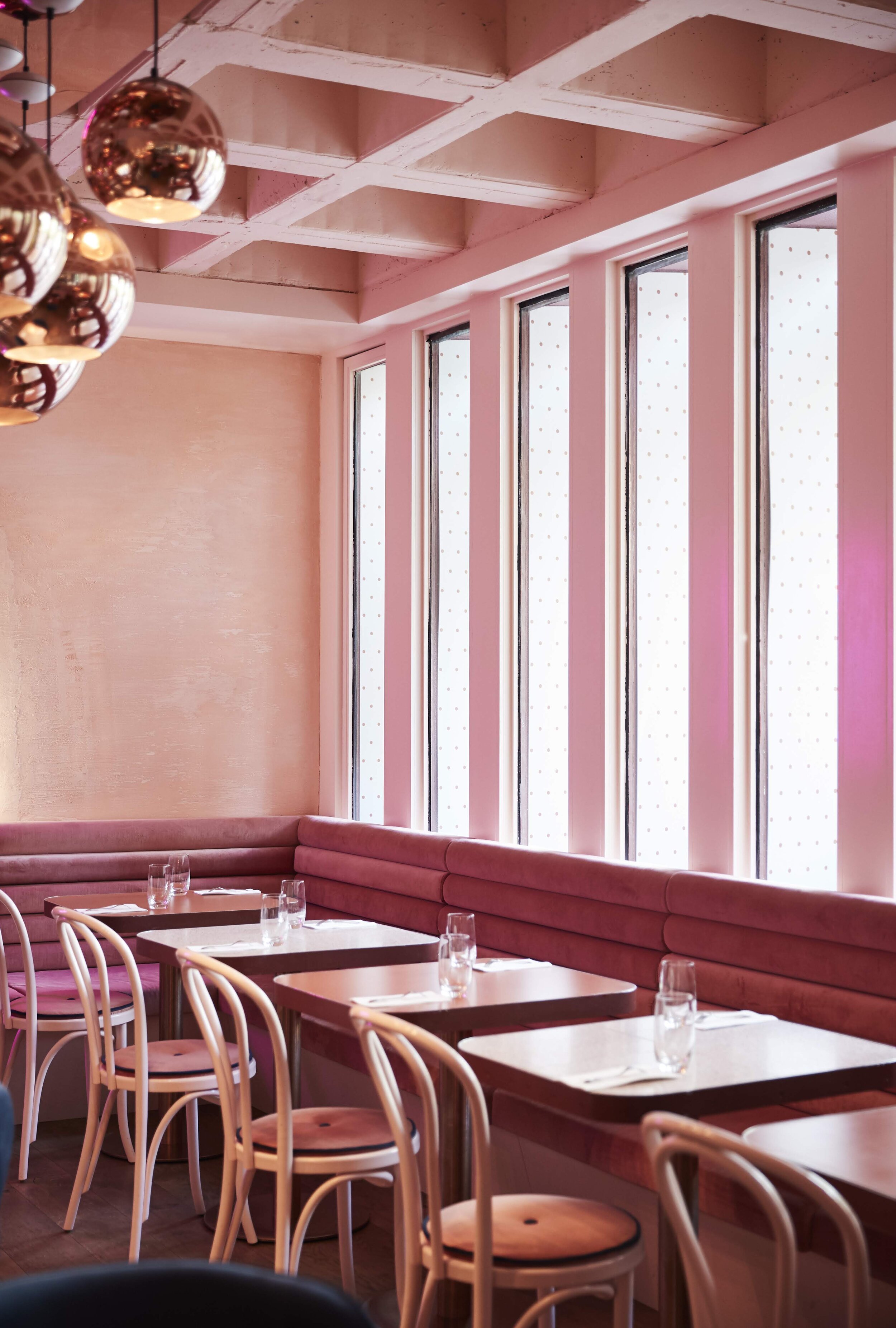
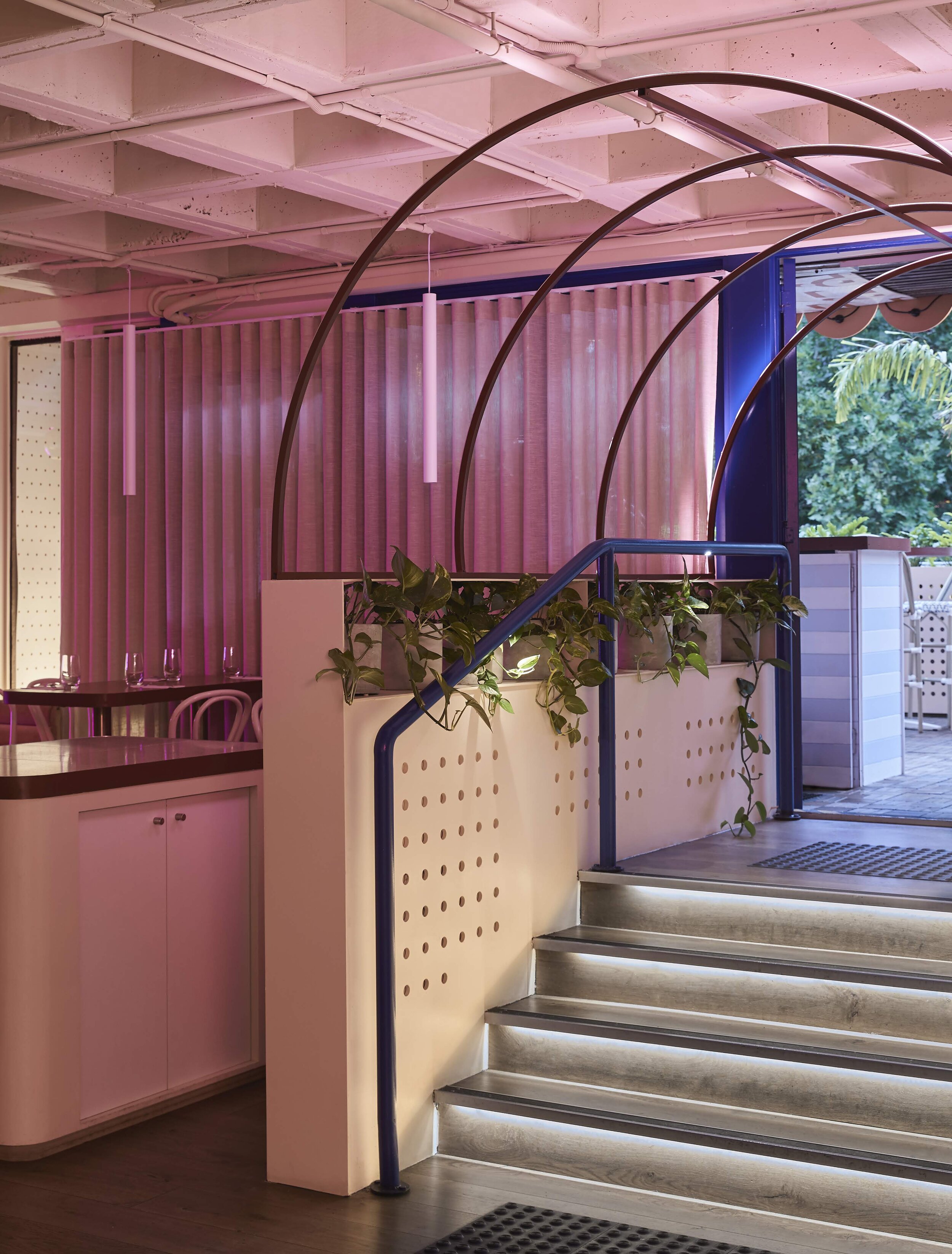
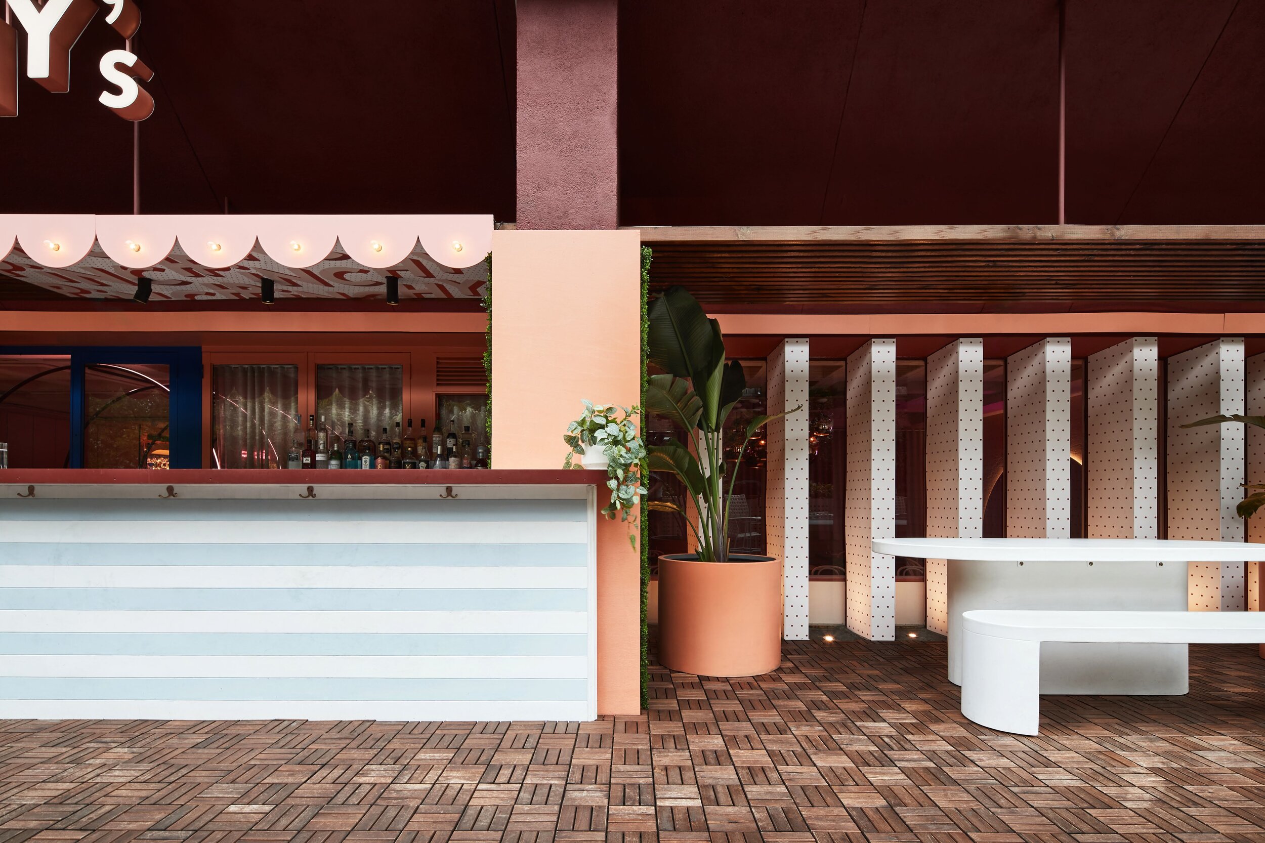
Live the Champagne & Lobster bar life. When Melbourne's favourite lobster brand, Pinchy's searched for the perfect place to open its very first flagship, it chose the iconic building at Mid City, Chinatown for its modernist details, brutalist ceiling and an expansive balcony to create an immersion like no other. The client brief was to create a one-of-a-kind immersive experience, celebrating all things 'made by sea'. It's very first flagship needed to express Pinchy's in a more mature and permanent way. The concept began with romantic escapism and discovery, delighting in the finer things in life where one could immerse to the beats and vibes of Bali or Cancun. A brutalist ceiling runs throughout, providing a curious journey from Champagne bar to dining and the moment of truth - an inner city oasis on the outdoor balcony. The site posed challenges, from the restricted natural light to its south-facing orientation. This included the circulation where previously installed partitions created a highly confined space.
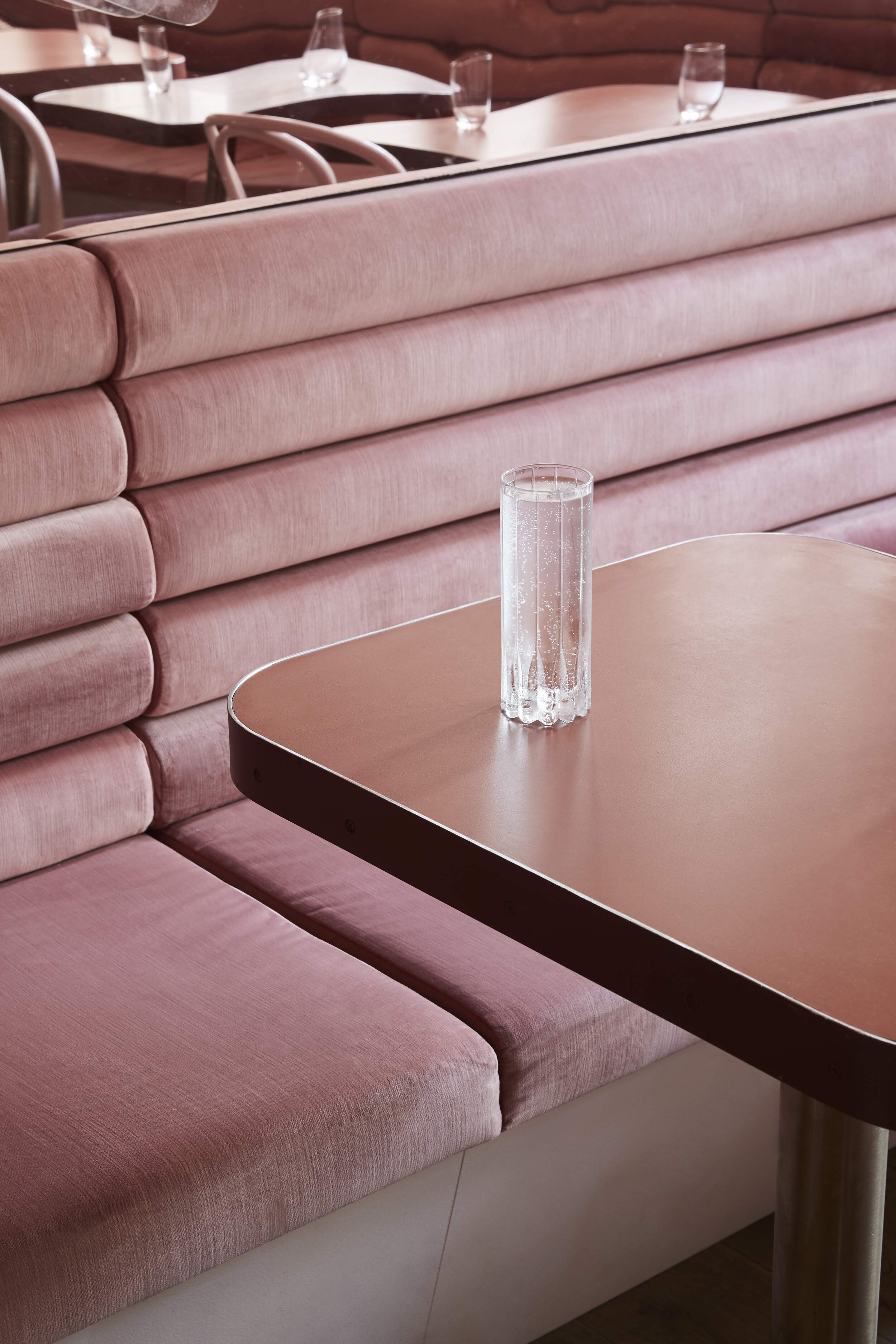
By using reflective and soft materials, interior lighting was significantly improved. Both booth and banquette seating was pushed towards the perimeter, providing flexibility for events and private parties. The existing flooring and signage posts were re-purposed to minimise wastage. Various materials and textiles including terrazzo, velvet upholstery, linen, natural timber, rose gold lampshades and mirrors neon signage were selected. Hues of blush, terracotta and sky blue were used, consistent with the Pinchy's colour palette.
CHALLENGES
To deliver a project exuding a premium bar and dining experience with very little budget available, the studio had to look at ways of repurposing and reusing as much of the existing site and materials as possible. A significant proportion of the budget was directed at what the patron would touch and feel; to impart a feeling of luxury whilst other areas provided visual cues and a cohesive backdrop. Finding cost-effective products and finishes to achieve a premium level of finish, while managing to ensure the project remained commercially viable for the client was a key focus on thinking ‘out-of-the-box’.
APPROACH
BrandWorks' ‘five senses approach’, where all the senses are engaged to create a holistic brand experience served as the foundation for its innovative design. The location on level one of Mid City was less than desired, with the venue adjacent to pedestrian amenity and non-curated retail, which did not complement the Pinchy’s brand experience. Visually, the signage and wayfinding needed to be eye-catching and draw patrons up the escalators. Pinchy’s signature brandmark overhead, festoon lighting arrays and bold decal graphics follow patrons up and upon arrival, striking neon and rose gold mirrors are ready to serve as moments for the social media inclined. The pink blush and terracotta palette intentionally takes patrons away to a place they would rather be. Soft materials and plush fabrics activate the sense of touch, to soften hard concrete surfaces from above and impart a sense of luxury, all within a modest budget.
Photo credit: Willem-Dirk du Toit.
