Empire Steak
BRANDING / WEBSITE / INTERIORS
Empire steak was inspired by a true love of the humble steak sandwich, the unsung hero of our time. Empire takes the humble Aussie staple - the steak sandwich - and offers it back to the public in a way that hasn’t been seen before.
The Empire Steak brand is built on the idea of ‘suburban prestige’. It takes references, inspiration and ideas from everyday suburbia. Think independent milk bar, laminex counter tops, terrazzo tiles, the ice cream kiosk beside the beach, concrete streetscapes, hand painted signage, brick walls, weather worn bill posters, Holden Commodores. Finding the beauty in those previously cringe inducing cultural particulars.
The brand is nostalgic 1950’s-80s, tactile, intuitive and thoughtful. Most importantly, all of its touch points are timeless and classic. In developing the concept the studio reflected on the founder’s motivations. The designers returned back to a time of authentic quality and honest pricing. Golden Gaytimes, Coca Cola in glass bottles and a steak sandwich you need two hands to hold on to. The humble priorities of a truly sunburnt country.
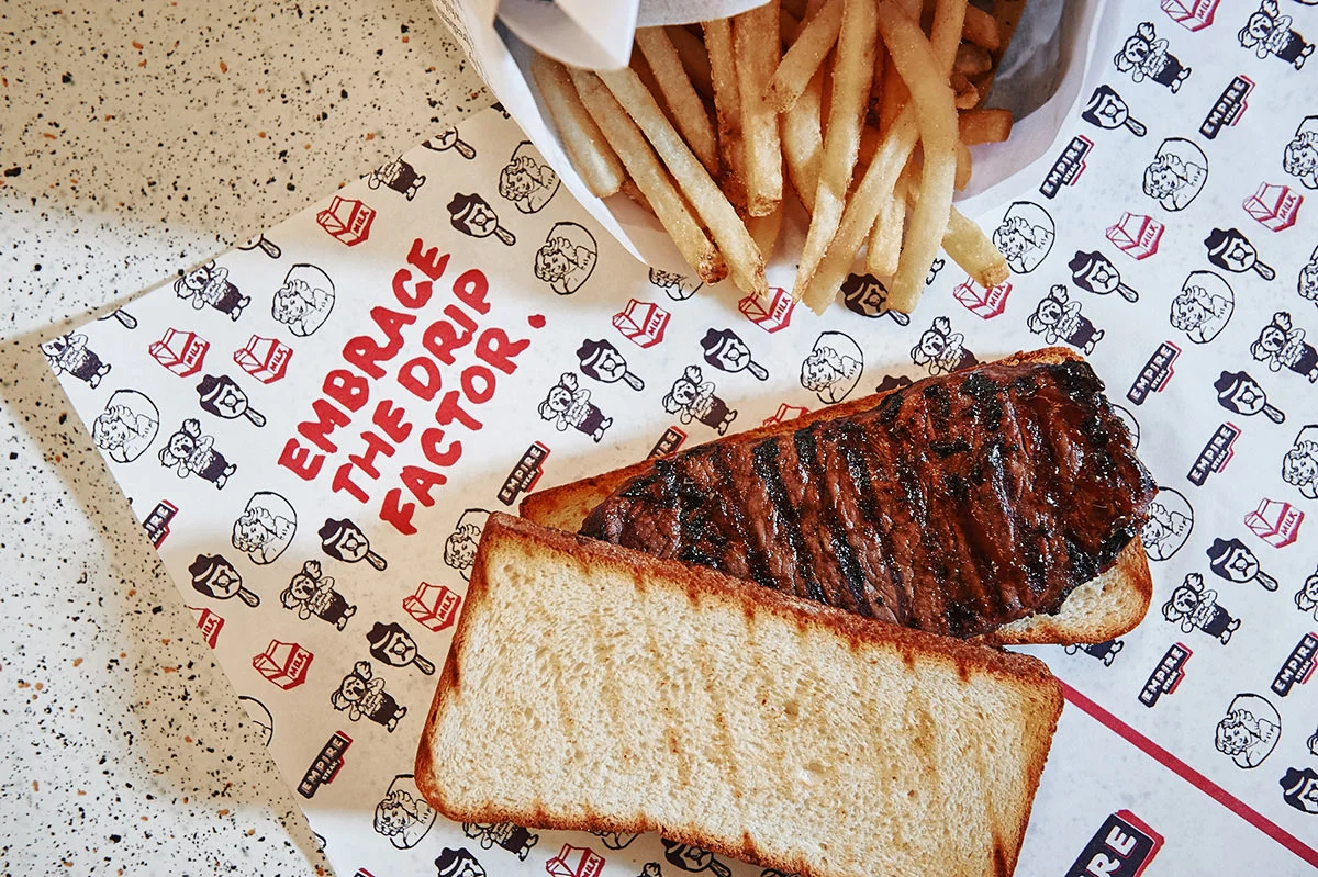
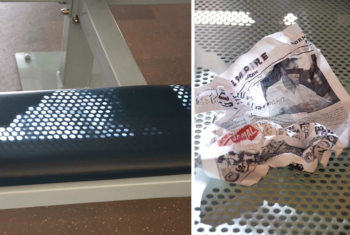
Executed through a series of cheeky graphics and slogans, the brand takes on the Aussie lifestyle in true blue fashion. The tone of voice is frank, generous, classic and honest – local and personable – in keeping with the brand foundation of suburban prestige. The brand personality extends through the interior with the use of humble materials, a washed out palette and a corrugated iron servery that speaks to your typical Mr Whippy window. Against the white backdrop the Empire Steak brand-mark stands prominent, simple and substantial in alignment with the food offering. The effect is one of welcomed nostalgia, the perfect setting to wrap both hands around and “embrace the drip factor” on a new breed of melt-in-your-mouth, cooked-to-perfection, steak sandwich.
Photographers: Brook James, Olivia Chen & Dean Schmideg
Interior signage hand painted by Larry Stammers
VIEW BRANDING VIDEO


